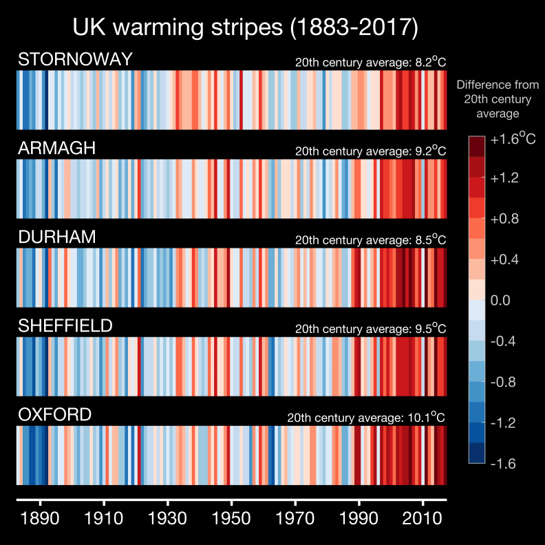
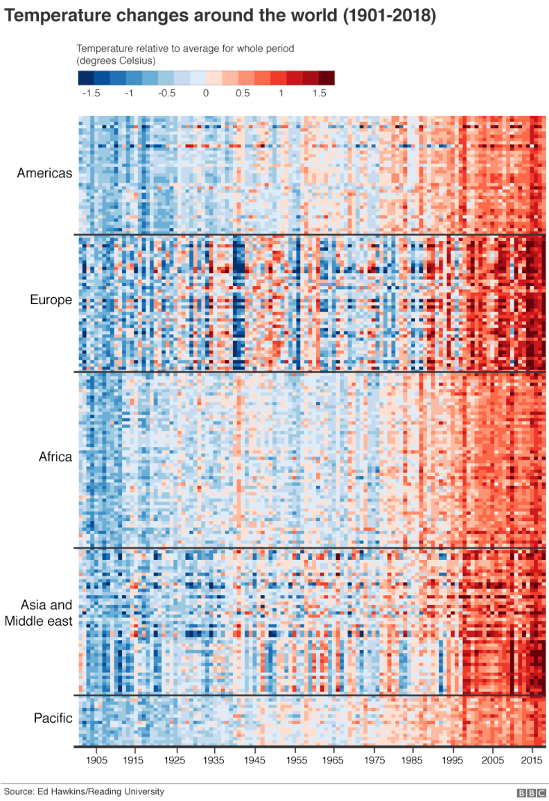
To represent the span of human history as a simple set of stripes may seem reductive. From one year to the next it feels like we cannot feel the difference.

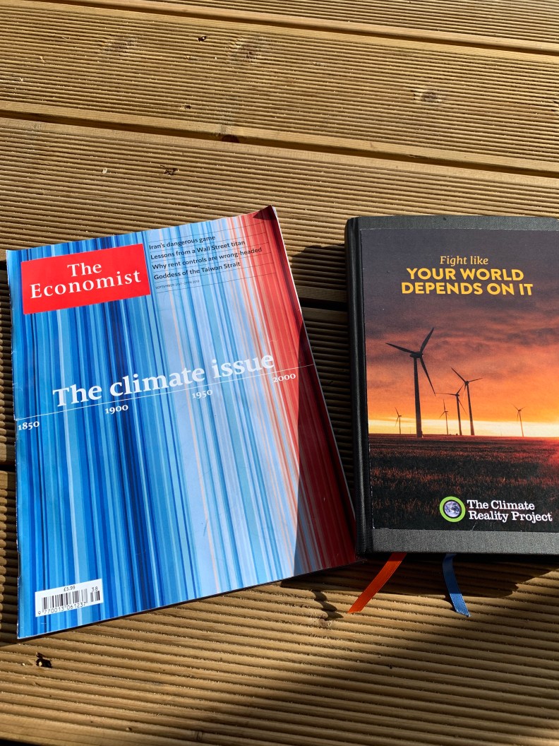
But as the decades stack up, the story becomes clear. The stripes here created by Professor Ed Hawkins from the University of Reading, which feature on the cover of this months Economist magazine tell quite a story.
Dark blue tears are cooler and the red ones are warmer than the average 1971-2000. The cumulative change jumps out. The world is about 1’C hotter than when The Economist was first written.
Find out the story behind the climate stripes here.
It’s a great visualisation. I think I’ll also need to purchase one of these ties!